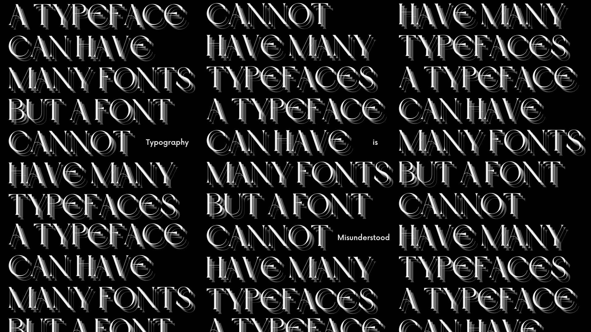
Typeface vs. typeface
Year
2023
Services
Typography
Layout Design
Design Research
Tools
Illustrator
Type Foundries
Photoshop
Credits
Whistling Woods International (TISS)
Details
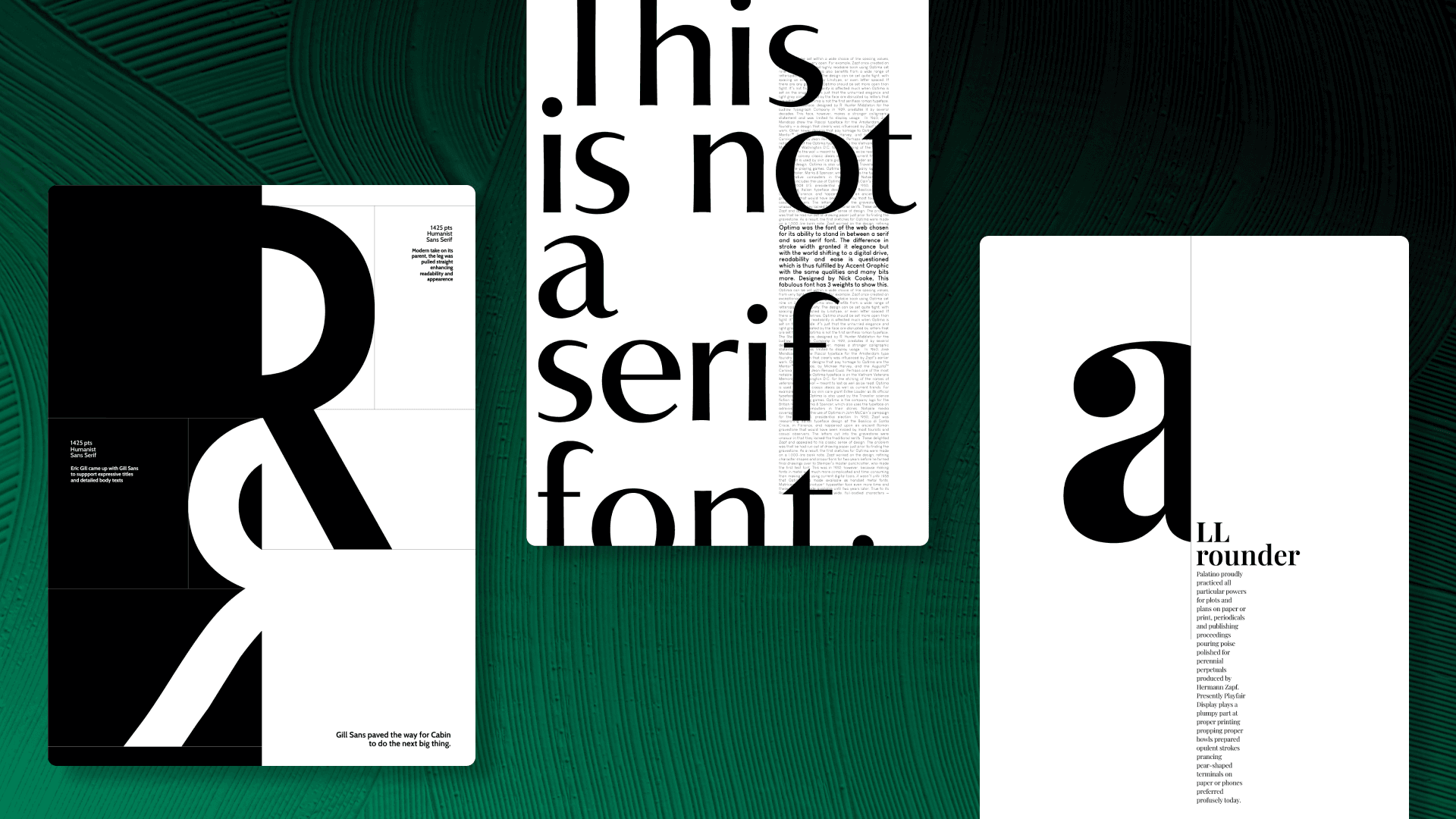
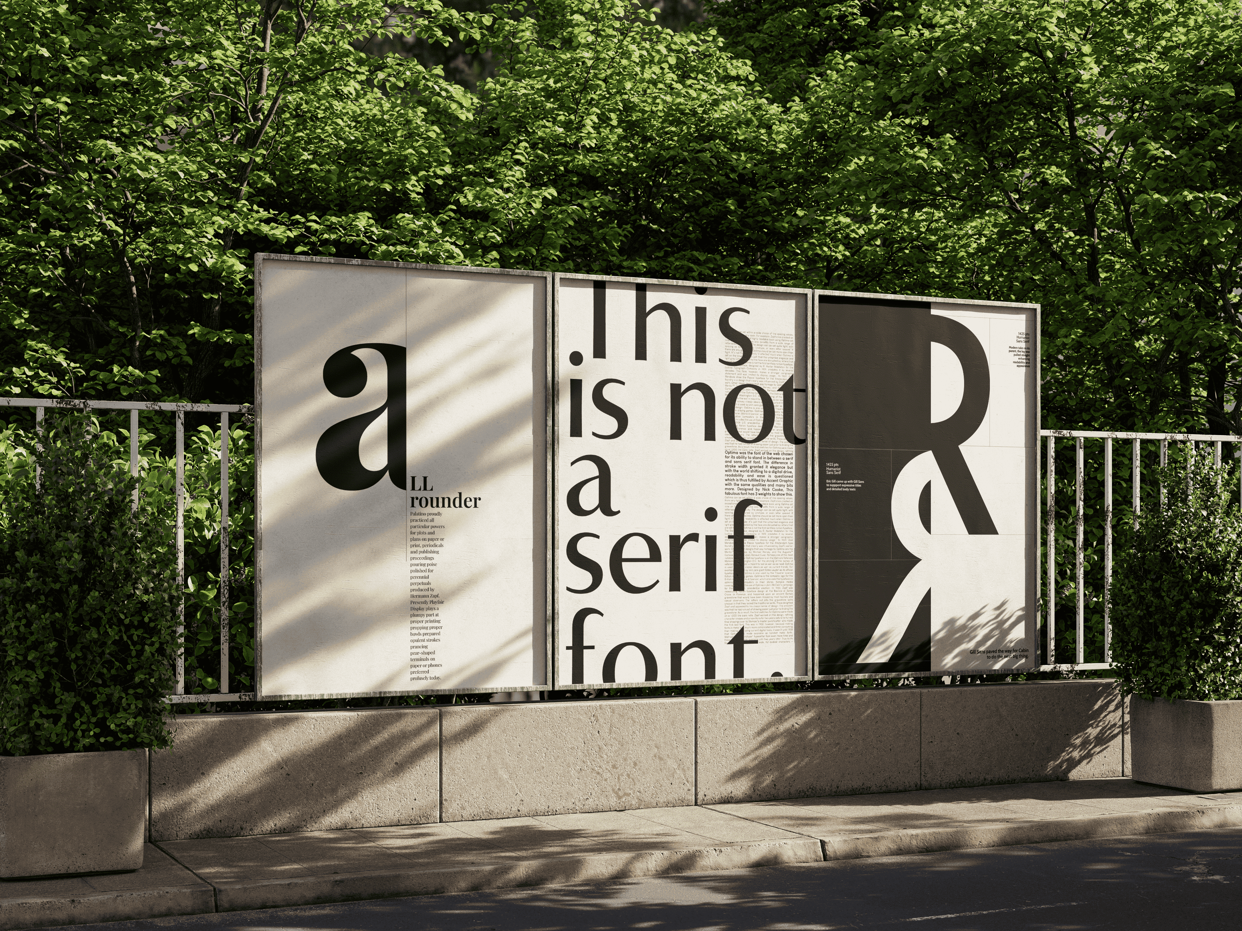
This project explored the nuances of typography through a series of minimalist typographic posters, each comparing two existing typefaces. The challenge was not to discredit the older typeface but to acknowledge its strengths and function while presenting a well-researched alternative in its place.
Designed with simplicity at its core, the posters avoided color and illustrative elements, relying purely on form, contrast, and composition to guide the viewer’s eye. Since the intended audience isn't familiar with the technicalities of typography, the focus was on making the information engaging—using bold visual hierarchy to draw attention, while the finer details encouraged deeper exploration.
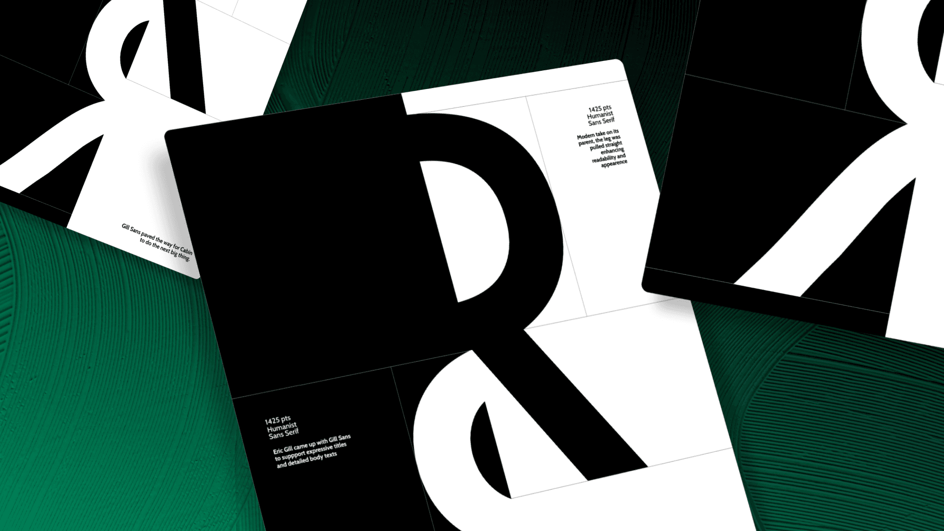
Gill Sans vs. Cabin
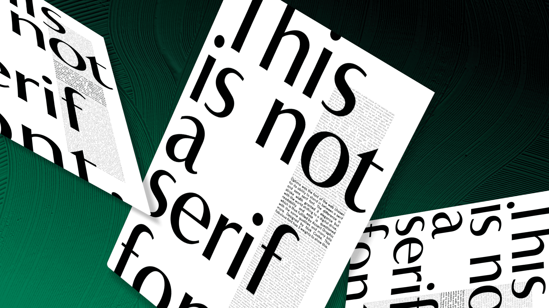
Optima vs. Accent Graphic
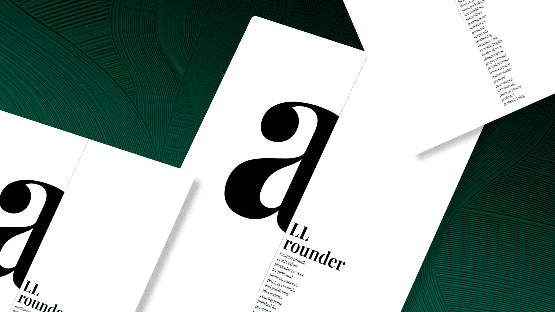
Palatino vs. Playfair Display
This project explored the nuances of typography through a series of minimalist typographic posters, each comparing two existing typefaces. The challenge was not to discredit the older typeface but to acknowledge its strengths and function while presenting a well-researched alternative in its place.
Designed with simplicity at its core, the posters avoided color and illustrative elements, relying purely on form, contrast, and composition to guide the viewer’s eye. Since the intended audience isn't familiar with the technicalities of typography, the focus was on making the information engaging—using bold visual hierarchy to draw attention, while the finer details encouraged deeper exploration.
Gill Sans vs. Cabin
Optima vs. Accent Graphic
Palatino vs. Playfair Display